Respect Walking Bear
Written by Francine Fash - August 23, 2019
Sunday the 18th represented Major
League Baseball's celebration of the Little League Classic.
This observation took form in making the Chicago Cubs and
Pittsburgh Pirates dress like children in Little
League-inspired uniforms. A pity how far western
civilization has fallen, that we encourage our men to
forever remain arrested in boyhood. This is disgusting as
more than a symbol of degeneracy. These uniforms bastardize
the rules of sporting uniforms in their usage of nicknames
on the jersey. Cubbies? The Burgh? We are inching towards
dangerously NBA territory, gentleman. These uniforms also
feature nicknames on the back, which treads on the gimmick
of Player's Weekend, which you can trust I will speak about
very soon in the future.

However, the Cubs Little League
Classic uniforms do feature a surprisingly beautiful diamond
in what is a general rough. The chosen cap insignia is the
'Walking Bear' first introduced in 1997.
This is the right decision not only
for a special uniform day, but for the Cubs uniform in
general. I shall surprise my fellow traditionalists in my
declaration that the Walking Bear should be adopted as the
Cubs' regular cap insignia. Perhaps my opinion seems less
blasphemous when I display my ideal cap on a real man like
Sammy Sosa.
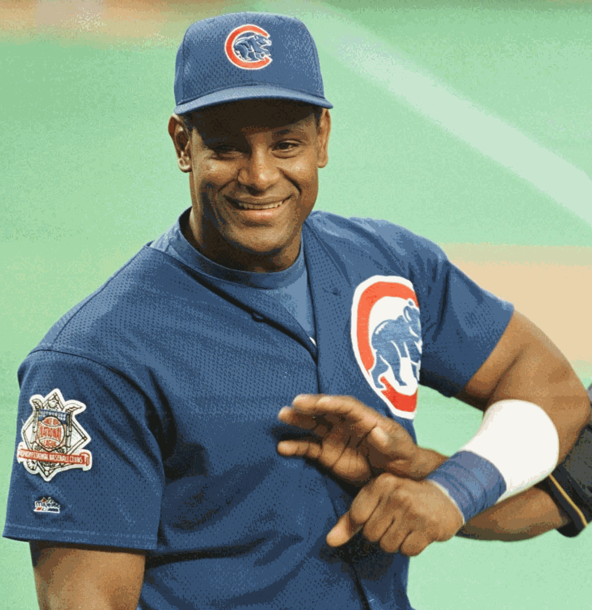
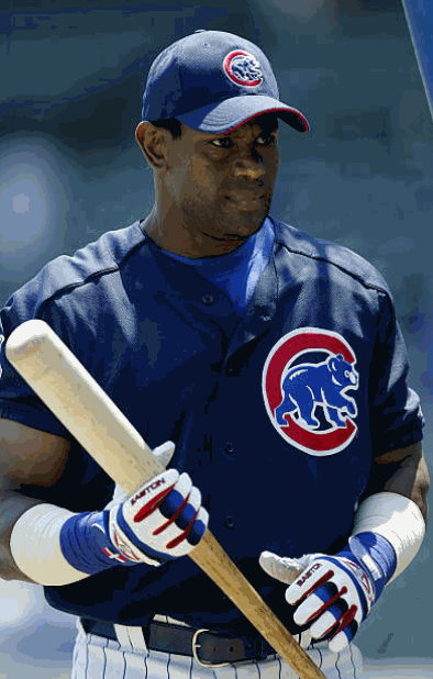
The royal blue Walking Bear cap was
worn in batting practice from 1999 to 2002, while the navy
blue variant of the Walking Bear cap was worn in batting
practice from 2003 to 2006. Sunday's Little League Classic
was the first instance of a Walking Bear cap being worn
during any regular season Major League play, although the
2019 caps are obviously not weaved with the mesh fabric of
batting practice headwear. Thank God.
But yes, I do believe these are the
hats that should be worn during all games by the Chicago
Cubs. I do not believe uniforms should be allowed an
existence in a vacuum. The New York Yankees may have the
most perfect uniforms in the eyes of the traditionalist, but
we all rightfully denounced the Florida Marlins when they
attempted a mid-2000s alternate jersey that was a mere play
of the Yankees pinstripes. The Cubs are not the only team
with a cap bearing an insignia that is nothing more than a
mere C. In fact, they are not the only team with a blue cap
combined with a red C insignia. The C-cap teams should
distinguish their C's from each other and cannot avoid
comparison between them until such actions are taken. As it
stands, the Cubs have the least interesting C in baseball.
While the wishbone C used by the Reds may be the most used
logo in all of C's, it is at least an effortful design. And
while the block C used by the Indians is subject to negative
comparisons with previous Indians logos, its
collegiate-style block text is not mirrored by any Major
League teams. The Cubs C is merely an incomplete circle. The
Walking Bear would be totally unique.
On top of the comparisons which are necessarily drawn between Cincinnati and Cleveland, the Chicago Cubs must held to similar standards as the other Chicago team. The Chicago White Sox have worn C-insignias for much of their history. Many of their C's were quite enjoyable, particularly the final C they ever wore, modeled by Sammy Sosa.
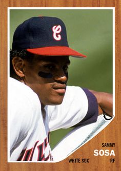 Even
with that beautifully unique C, the White Sox received much
criticism for wearing a blue hat with a red C, when their
crosstown rivals wear the same. The White Sox wised up and
introduced their "Sox" insignia, which has been worn ever
since 1991 to universal praise. The letter used on a cap
insignia always stands for the city name, not the mascot,
unless explicitly specified otherwise. When there are two
teams in the same city, it is arrogant for one team to wear
the city's initial as the lone representative of the town,
when the other team does not. Of course, the New York
Yankees and Mets both wear the letters NY, but both
franchises are complicit in that act of mutualism. The White
Sox gracefully stepped down from claiming to speak for all
of Chicago, it is time that the Cubs do the same. You may
say the Cubs would have a C on their head no matter what
because Cubs and Chicago both start with a C, but until an
actual Cub is placed inside the C, it can only be assumed
they are claiming themselves to be the sole speakers of
Chicago.
Most importantly, the Walking Bear is
representative of Sammy Sosa, and the number one duty of
Chicago Cubs baseball should be to keep alight the legacy of
Sosa. Besides being introduced at the height of Sammy's
reign starting in 1997, the Walking Bear was a reflection of
1990s logo design trends. The trend in the 1990s was to
create animal logos that were highly detailed and
realistically drawn. This trend was more prevalent in other
football and basketball, especially at the collegiate level,
but in baseball we saw it with the ornithologically accurate
Oriole, the inaugural Florida Marlins fish logo, and with
the Walking Bear. If the Cubs insist on wearing their 1997
uniforms, they should be accompanied by a characteristically
1997 and Sosalogically-informed cap insignia.
