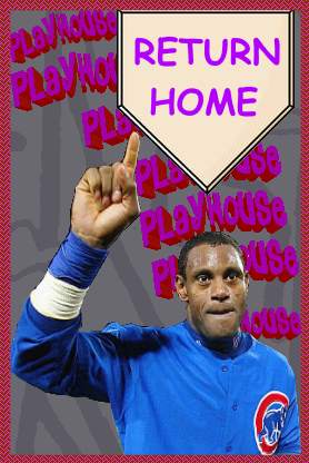
The Notorious BiG: Previewing the 2020 Milwaukee Brewers Uniforms
Written by Francine Fash - March 27, 2020
A fire has burned for years, fed with
Milwaukee Brewers uniforms featuring logos other than the
Ball-in-Glove and San Diego Padres uniforms in colors other
than brown. The Brewers and Padres are in the midst of a
victory lap declaring a return to the purity of their
heritage. Are they right to hail victory, or their new
uniforms a mere distraction from a hidden degeneracy?
It is our responsibility as
Fascionistas honor the blood shed by our ancestors in the
two foremost battles of the sports uniform world by
uncovering the truth and reviewing the new Brewers and
Padres uniforms.
MILWAUKEE BREWERS
Some Fascionistas die on the hill
that the Ball-in-Glove is not enough to restore the purity
of the Milwaukee Brewers, as a return to royal blue is
equally imperative to their heritage. I, however, draw a
distinction between the Milwaukee Brewers of the American
League, and the Milwaukee Brewers of the National League. It
was sacrilege when the AL Brewers dared to don navy blue,
but upon moving to the National League Central in 1998,
Milwaukee has been correct to wear navy rather than royal.
Lest we forget it is the dream of Fascionistas for every
division in baseball to display diversity in color. Our goal
is for no two teams in the same division to share the same
primary color. Of course, there are few teams where victory
is even close, but the National League is close. Should the
Brewers wear royal blue, they would be the second team in
the division to primarily wear royal, sharing the shade with
the Chicago Cubs. As disgustingly overused as navy blue is
across Major League Baseball, the Brewers are the only team
in the National League Central to wear it as a primary
color, and the combination of the shade with yellow as a
secondary color is unique for both leagues. Now, the only
primary color that is repeated by two teams in the NL
Central is red, shared by the Cardinals and the Reds, who
both reserve special right to the color despite being
division rivals. The decision to keep royal blue is correct.
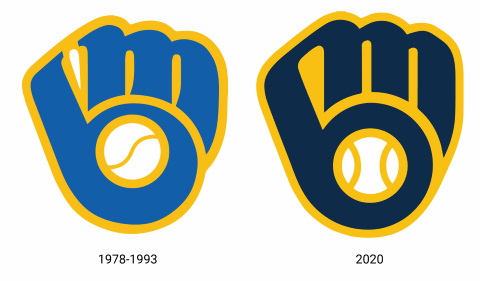
Now we must address where most
attention is: the Ball-in-Glove itself. This logo is
disgusting compared to all previous iterations of the BiG.
The most obvious degeneration the centered ball, and the
perfectly round circle making up the B. Despite technically
being an act of graphic centering, the ball is actually less
in focus now than it was originally, as now it appears that
the B portion of the glove is being crushed by the weight of
the M as opposed to supporting an M that has been stitched
on, like a glove. The two perfectly centered seams of the
2020 BiG's ball, as opposed to the imperfect single seam of
the original 1978's BiG, makes it the ballness of the ball
too obvious. The single seam of the original ball is a
byproduct of being a graphic rather than a photograph, it
shows us a visual representation of ball without attempting
to provide realism that is only possible with a photograph.
The new BiG's double seam's underestimate our intelligence,
they expect us not to realize it is a ball unless it looks
like a real ball, yet the perfect centering, ironically, is
too perfect to occur in a natural act of catching a ball.
To divert from the standard
Fascionista party line, I never supported the white
stitching of the original BiG. I respect that it conveyed
that the space between the M and B is, in fact, stitching,
but visually, I preferred the visual consistency offered
when the stitching was blue and maintain that the goal of
conveying the stitching can be accomplished in colors of
white. Of course, the only iteration of the BiG with blue
stitching was the 2016 navy alternate, which was switched to
white after one single year because so many Fascionistas
rightfully defended their heritage. Let it be clear that,
despite my preference for blue stitching over white, both
colors are vastly superior to the degenerate yellow
stitching of the new BiG. Despite not taking up any more
technical space than the previous stitching, the space
appears wider due to the yellowed white space blending with
the white outlines of the M and B. On the note of outlines,
the yellow outline connecting the B and M has been changed
to blue and given a separate yellow outline. Anyone who
thinks such a needles change could be a visual improvement
must have inferior genes.
The difference between the underlying
ideologies of the original BiG and the new iteration is as
follows. The original BiG was a glove that looked like and M
and a B; the new BiG is an M and a B that looks like a
glove. This gross misunderstanding of the original theory is
why we Fascionistas must impose ideological uniform
education from birth.
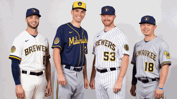
Returning to optimism, the
cream-colored primary home uniform, modeled by (((Ryan
Braun))), deserves much praise where other cream uniforms
deserve execution. The recent trend of "fauxback" cream
uniforms followed by teams like the Seattle Mariners are a
ploy into exciting degenerates who think the jerseys are
connections to their heritage; cream was never a part of the
jerseys the Mariners fauxbacks pretend to mimic, nor was
cream ever so standard in history that it is a true
representation of past times. Furthermore, there is simply
no aesthetic superiority of cream jerseys over white purity
in most cases. The San Francisco reserve a birthright to
wear cream, as it is their heritage, and they respect the
cream by wearing it as a primary. The Brewers will also
commit to cream as a primary, which is honorable. Despite
having no history of wearing cream, Milwaukee has been
dubbed "The Cream City", so it is right for the Brewers to
march with their Buck brothers in raising the cream sword.
The wordmark on the home jersey is both a reference to the
1970s Brewers uniform, widened notably to allude to
contemporary craft beer label typography, similarly to the
2000 Brewers uniforms current towards the commercial beer
cans of the time. Fascionistas should support everything
about the cream jerseys.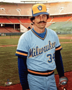
We should not support the alternate
home pinstripes, however. Our opposition has nothing to do
with aesthetics. In fact, it is my opinion that the white
pinstripes look quite good, as they are identical to the
beautiful throwbacks worn from 2006-2019, with royal blue
being switch for navy. We oppose the pinstripes on principle
that teams should be allowed a primary white or off-white
home jersey, one colored alternate if they so choose, and an
occasional throwback alternate if historically significant.
The royal, pinstriped throwback introduced in 2006 was
historically significant, and would be both relevant and
admissible today, if and only if it remained in royal.
Wearing royal when official colors are navy denote the
status as a throwback; navy pinstripes are nothing but an
alternate. The navy pinstripes might have made a fine
primary jersey, but the choice was made to commission the
stripeless creams, rightfully, and that decision must be
consistently respected.
The road grays of the new uniforms
are acceptable in and of themselves, for the typeface is
nice and they feature the city name while the previous
Brewers road set featured the team name, but they disrespect
Milwaukee's heritage by sporting a gray canvas. As countless
teams who do not belong in powder blue hop on the powder
blue bandwagon, teams like the Brewers who belong in powder
blue have a responsibility to wear it in order shun the
degenerates. While most teams who wore powder blue road
uniforms during the 70s switched to them from historically
established grays, the Brewers were founded with powder blue
as the only canvas for their road uniforms. They did not
have a gray uniform until 1985. Fascionistas reject the
arbitrary code that all road jerseys must be gray; we
support powder blue if and only if it is used as the canvas
for the primary road jerseys and trousers. We support powder
blue for a small number of teams, but no other must wear
powder blue; most of the teams currently adopting powder
blue ought not to wear it, especially since they choose to
wear it at home, but the Brewers are amongst the teams that
should wear it. The teams who must wear powder blue roads
are as follows: Brewers, Royals (their current powder blues
are unacceptable for not applying to the trousers and
wearing them as a home alt), Blue Jays (they are closest to
victory for wearing theirs on the road, but they do wear it
at home), Phillies (they currently fail by wearing theirs as
a home alternate throwback), Expos (if/when they return). We
would support the Cubs in powder blue, but it is not a part
of our party platform. As nice as the road grays may look,
we must continue fighting in the name of powder blue purity.
There is, of course, a navy blue
alternate colored top. The Brewers, more than most teams,
had become notorious for overusing their navy alts, both at
home and on the road, during the previous set's reign. They
used the blue top with more moderation during the Jenkins
era, but the (((Braun))) era Brewers had leaned especially
towards the blue. Whether or not you wish to believe the
Brewers organization, they have declared that the new blue
tops will be exclusively worn as a road alternate, so
hopefully, one crisis has been averted. I am not so fond of
the jersey itself. The cursive script attempts to reference
the road script of the first BiG era, but the new script is
far too obvious in its digitization. The larger issue with
the new script is that its solid yellow writing lacks any
sort of outline, while the original script was blue with a
yellow outline. Of course, with a blue canvas, that isn't an
option, but they yellow script could be blue with the
outline yellow, and it would look great. The lack of an
outline not only looks cheap it, also blends into the yellow
piping as if they were a single graphic. Speaking of, why
exactly is there piping on this jersey? There is no piping
anywhere else in the set, and the only time piping has been
used in any Brewers set was in the controversial Morte Bame
era of the 90s, of which the only possible reference in this
set are the sleeve stripes on the road grays. They likely
added the piping to add some more color to make the yellow
script less alone, but a blue script with yellow outline
would have looked more consistent. The road alternate also
comes with a yellow front paneled cap, used only with this
alternate. Fascionistas support teams utilizing differently
colored front panels on their caps, and we uphold the
original royal-and-yellow road cap of the 80s Brewers set as
a fine cap, but the yellow panel is too large on the current
set. From most camera angles, you will not be able to see
that the rest of the crown is blue. Its specific pairing
with the colored top is another possible reason that the
yellow piping might have been seen as necessary, as the hat
would be rather out-of-place if it were the only
yellow-dominant element of the set. This alternate, if it
must exist at all (it shouldn't), should lean more on navy
blue, with yellow being used as an outline. The yellow-panel
cap should exist, but it should be paired with the primary
road jersey. This would look odd with the current gray roads
due to their inherent drabness, but they would look
excellent with powder blue roads.
There are two new arm patches in this
set - one for the road, one for home. That itself is a
crime; there is no need for two separate alternate logos.
Both logos are patched onto the left sleeve, while the right
sleeve has a patch commemorating the Brewers' 50th
Anniversary in 2020. The other crime related to these logos,
is that one of them is frankly awful. The ball with barley
as seams is punishable by death. We get it, Brewers, you're
the beer team. It's already in your name, alluded to by your
excellent font choice, explicitly referenced by the Barrel
Man mascot, and implicitly referenced by the other mascot
(Bernie may not slide into a beer keg anymore, but we all
know the new pool has concentration above the legal limit).
You do not need to put barley everywhere. The barley on the
previous set's insignia was great, but the entire identity
was designed around it. The new identity is designed around
nostalgia. Arguably, the barley could be there to reference
the 2000-19 identity in the same way that everything else is
a reference to something from the Brewers' uniform history,
but the choice of navy over royal already accomplishes that.
Barley or no barley, a lone baseball with no lettering does
nothing to signify 'Brewers' without further prompting. From
a distance, the barley is not even visible. This dreadful
logo is the arm patch for both home jerseys. 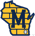
The other alternate logo, worn on the
road, is quite good. It's the State of the Wisconsin,
Michigan-M logo used throughout the 70s, with royal switched
to navy, no white outline over the Michigan-M, and bricks
laid over the state to represent Milwaukee's manufacturing
sector. The vague connection to Milwaukee is a bit much,
especially since the globalists have done away with much of
Wisconsin's blue-collar economy, but the logo does look
good. Forced symbolism aside, the bricks do add a
much-needed dose of blue in order to support the Michigan-M,
and it does resemble a contemporary beer label.
Much of this identity is based around
craft brewery design aesthetics. I dislike these elements on
the degenerate hipster beer labels themselves, but they do
look good on the uniform and would look good without the
connection. They are there to be strengthen the beer theme
of the Brewers in the same way that the 2000 set did by
leaning on the sodapop-esque beer aesthetics of the time,
but just as those beer trends were eventually considered
outdated while the team kept wearing them on their uniforms,
the Brewers are setting themselves up for sporting a dated
whenever beer design trends change next. Arguably, the
design could be considered good enough on its own that it
can stand strong when beer design changes, but the test of
time will decide soon enough.
Gentlemen, the implementation of the
Ball-in-Glove we have fought for above all other logos in
some full-time form cannot be considered a victory. This is
a step in the right direction, but Fascionistas have a duty
to honor our ancestors who have died in this struggle. The
struggle must continue, and it will.
Next time, we will assess the San Diego Padres' return to brown.
Onward towards victory!